Wednesday 19 December 2012

Album Cover Feedback


We printed 30 questionnaires that we devised ourselves after just finishing our design for the album front and back cover. This is are feedback for each question..


1. What are your first impressions of the album cover?
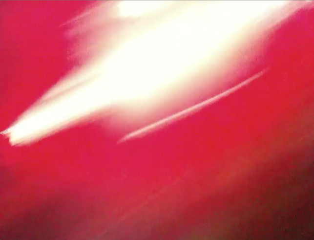
-Bright, colourful and attracts the eye.
-"It reminds me of strobe lights, seems like a party is going on"
-Very bright, simple but very effective
-Looks very unique original ideas 
-Well designed, artistic and looks profressional
-Intriguing 


2. Do you think the front cover looks like an authentic album cover?
28/30 said "YES"
2/30 said "NO"

3. Do you think the back cover looks authentic?
All answered with "YES"


4. What genre of music do you think this album sleeve would be suited to?
- Indie 10
-Punk 5
-Ska 4
-Dance 3
-Alternative 2
-Reggae 2
-Rock 2
-"Heavy and Loud"
-"Somthing fast paced"

Most people said it would suit an Indie genre, but mostly uptempo genres were suggested. 

5. Do you think the font matches or contrasts with the imagery?
- "Contrasts as it stands out"
-"The colours work well"
-"The simplicity of the font doesn't overpower the imagery"
-"Suits the imagery as it is simple"
"it matches and doesn't detract the impact of the imagery"
"Natural with image"
"The font makes the cover look profressional"
"The white font helps it stand out against the red"

"Too predictable"- Hipster

6. What do you like most about the covers?
-"The simplicity, yet maintaining boldness and creativity"
"Blues and reds work well"
"It draws my attention"
"It is very bright and intriguing"
"Vibrancy"
"Lots of energy"
-"Blurred colours, party-like"
-"Abstract"
-"The text"


8.

Sunday 16 December 2012

Target Audience

Roles Of Team

We have specifically assigned ourselves to do different roles to get our video made as effectively as possible. Although often we collaborated and helped each other to carry out certain aspects to ensure that everyone's creative ideas were shared and produce something we were all satisfied with.
Editing- Jake
Filming- Izaak
Editing Music and Timing- Adam
Digipak- Ben
Poster-

Thursday 13 December 2012

Creating the digipak: Ideas

After filming a set by the band Moon Street, we managed to pull some very vibrant and energetic screenshots created by the stage lights at their performance. The stills were very vivid and minimilistic but had this energy to them which we thought would suit the fast paced ska music they produce. The pinks and blues hue well together and the blurred streaks that occur provide the liveliness.

Here are the screenshots


Using these screenshots we have formulated four possible ideas for the album artwork in conjunction with this typewriter-esque font. The band's name is made larger and the album title smaller which is a typical convention in album covers.


Vassup


Wednesday 5 December 2012

Digipak & Album Cover research

This album cover is from glam-rock band The Killers. The front and back match seamlessly both featuring a blueish hue. The band title and album title sit in the middle, both with different font to identify which is which. You would assume the band is called The Killers because the font is larger and sits on top rather than below.
The back cover features the song titles in the top right, listed and numbered. At the bottom information about the record label can be found with the record label logo. Also a barcode features for sale in stores.


This is the front/ back cover for the Arctic Monkeys album Favourite Worst Nightmare. It is not a typical hard plastic casing digipak, instead a soft card with a plastic ring inside to hold the CD.


Here the songs feature at the bottom with merely but a space between each song title. This is so the buyer can identify what tracks will be on the album and the order. 


The digipak opens outwards left and right to reveal the CD, this method of packaging is becoming more and more frequent as artists get to display more visuals.


Rough Cut Feedback

The Rough Cut was shown to our media class in full and we then asked for their thoughts on all aspects of the cut. Here is the feedback:

The Good:
-The fish eye lens gave the video a creative edge and suited the genre of music exceptionally.
-The lip syncing and timing was spot on and never out of time.
- The lighting enhances the performance shots, the saturation of colour works well and enables the band members to stand out from the background.
-The varied use of camerawork stood out for some as they thought it gave the video more energy and gave the video a more interesting aspect visually.
-The fast paced editing matches the song in the correct areas, in particular the bridge and chorus.
-The opening drew the audience in and created a slow build up to the actual song.
-The narrative aspect of the light bulb received positive reactions also as many said it added a sense of humour into the video and kept the audience entertained.

The Not So Good (Areas for improvement)
-The footage of the live set had some interesting colours and provided an energetic aspect but was not in keeping with the lighting and quality of the rest of the video. This we will consider taking out or using elsewhere in our coursework.
-The Girl dancing to the song didn't feature much and many were curious and didnt understand why she was there. This we will hopefully expand on when we go out on our second shoot.
-There were possibly too many of the same shots used of the performances. This again we will balance out when we film our further ideas.

In general the comments received were extremely constructive and gave us confidence which we will carry on through to when we film the rest of the video. We will make adjustments to improve our video where the negative feedback instructed us to do so. This feedback has helped us to stay on track

Rough Cut


Here is the rough cut footage of our music video we uploaded to YouTube. We've assembled all the footage from our first shoot into order to give us an idea of what the video looks like and what else needs to be done. We are very happy with the outcome so far, all our ideas have come together very fittingly and its all in keeping with the tempo. 
The opening sequence we have looped the guitar strumming and muffled it so that it appears the band are actually playing the garage as the camera pans and follows through. The chorus' work extremely well I feel where we have edited the four shots from each corner directly on the beat. The break in the song is where our idea that the bulb goes out and the lead singer taps it to get it working again, and thus the song continues. We will use a sound effect there to accentuate that and make it more realistic. 
The use of fish eye lens manages to fit the whole band in, also making the room feel even smaller and at times claustrophobic. This matches the lyrics and tones of the song appropriately.
The point of view shot from the drumstick gives the video an interesting visual as well as the views from the neck of the guitar looking down on the strums. The part of the video where the musicians are dancing we used different techniques such as pans and varied camera angles which make for an exciting illustration of that part of the song.
At the end of the video our idea is to use a reverb of guitar noises you would hear at the end of a live song, to enhance the realism of the performance. The shot from inside the fridge shows the band members relax with a beer, as if just finished playing the song. We shot it so that each beer would eventually go and the fridge door closes behind with a fade to black marking the end of the video.


Editing Process (Round 1)

After our first shoot, we have decided to edit all the footage we had so far to make sense of the video at the current time. Using the apple software Final Cut Pro we were able to easily import the footage and edit with visuals and sounds. Firstly importing the song onto a new file made it easy to know where to place a clip and for how long. From the window in the top right we were able to view our clips and simply drag them into place. By clicking on the edge of a clip we were able to resize the length of a clip from start to finish. 
We knew that the song was fast paced and needed fast paced edits to match this. The performance clips were rearranged and used in various parts of the video and matched up to the song. This took a while as the timing was difficult to anticipate, but using the zoom tool we were able to locate the exact part of the song that the video matched up to. 
The screenshots below are taken from the bridge of the song where we shot the band from four angles. In Final Cut we managed to change from each different angles directly on the beat. At the end, we juxtaposed the 4 different clips faster to match the bassline. 


This is a screenshot of all our footage in place after the first shoot. We are now able to continue filming and now have a better idea of the amount of footage that needs to be filmed.


Log diary 1

Our first batch of filming began on 1/11/12. It made sense to film all the performance shots first inside the garage so that we had substantial footage to work with when we were editing. We had organised a week before the band to come down with all their instruments and equipment to the location, which was in one of our garages. Before filming could begin we cleared out the garage to ensure that it looked like a typical garage setting. We set up the bands equipment with the drums at the back, two guitarists left and right and the lead singer in the middle-a typical band set up in a live performance. We then set up the lighting, the flood light behind the camera angled at the whole band. We also had two filler lights either side of the room which were bulbs, one of which dangled from the ceiling. The lighting setup worked as planned, making the band stand out whilst the rest of the garage looked dingy and "grotty" as mentioned in the lyrics.
      We ensured that we stuck to the storyboard throughout however certain aspects didn't work and so we came up with new ideas there and then. We set up the camera mounted upon the tripod and were ready to begin filming. The song played out from our laptop for the band to hear and keep in time with, as we realised if they had just played the song it would be slightly out of time. We filmed from various angles the whole song of the band, and then attached the fish eye lens to the camera and tried again from different angles. We filmed close ups of the drummer playing certain parts and the lead singer mouthing the words to the camera. Parts of instruments were shot too, during the guitar solo part we held the camera at the neck of the guitar looking down. Also we attached the camera to the drumstick and hit a drum in time to the song which was a spontaneous creative idea.
The tripod set up looking down at the drums and symbols


As the sky darkened and cloud thickened we thought it was good to shoot the outside point of view shot to get a dingy and dark feeling. The POV starts from looking up then gradually moves into the garage room as if you are entering in to watch the performance. This had to be done twice as we had trouble with the timing and playing of the song initially.

We adjusted the lighting when filming the girl dancing to the song so that it was more saturated and rosier. This was to enhance the idea of the romance the singer is talking about in the song. We also adjusted the lighting for when the band are laughing/ dancing knee-ups. We brightened it so that the band were more visible and it created a slightly more upbeat tone. Here we used camera movements to conjunct with the rhythm of the song. Also we used a technique of flooding light into the camera when the band were laughing.

Lastly the fridge shot was filmed, luckily the fridge already situated in the garage we just had to clear it out for use. We placed 4 beers for each of the members inside and placed the camera behind and continuously filmed them walking up to the fridge and taking a beer. This took a couple of attempts as we were not able to look at the camera whilst it was rolling.


risk assessment


final logo


Here is the moon picture that has been sized to the logo drawing and cut around to fit using toolsndhsgbh

Made 3 layers for moon and layered image over the sketch


Made the effect "Hard Light" to give moon shadow.


dig dag doo

Logos


Research into Logos

For the digipak and advert design we have looked at artists in a similar genre's logo designs. Artists have logos for audiences to instantly recognise a piece of work to that artist, most artists just have a name styled in a certain font whereas others have purely a logo and no words. 
 This logo is for the 1980's ska band Madness whose logo is the first letter of the name styled into a man in a suit and hat-a fashion style the whole band were renowned for wearing in music videos and on stage. 


Other artists rely purely on font design and colour to distinguish themselves from other acts and to be instantly recognisable. 


Problems Encountered


1. Organisation
The main issue we have found so far is that organising for all of us as well as the band to get together at one time, is very difficult. As everyone has commitments such as college and work, the availability of everyone at the same time, has been very minimal. To overcome this we have begun to plan with more time in advance, so that people are more available

2. Time Management 
Another thing we have struggled with is how effectively we manage our time. There have been occasions during lessons where we have been easily distracted and not made the most of the time we have to proactive. To counteract this, again we have started to plan more so that everyone in our group has a clear idea of what we need to achieve and when

3.Editing 
Finally, editing has been a tricky process so far. Mostly we have found it difficult to get all of our clips properly in, so that the lip syncing is accurate and realistic. This is what we have been spending most of our time on recently, and through investing a lot of time into it and asking others if they think that it is accurate we have managed to fit the lip syncing in to a standard that we are all really pleased with

Shooting Schedule

Lighting Plan

During the filming of the performance shots we will have several lights plotted around the garage. There will be the already fitted stand alone light bulb hanging from the ceiling, but this is not very bright so will be used more as of a prop. Two desktop lamps will be used either sides of the set up of the band to be used as filler lighting. The main light source will be an industrial floodlight. It will be placed hanging from the ceiling so that the members of the band look more aesthetically pleasing. It will also brighten up the whole room, we can adjust the brightness using the smaller lamps to create a more gloomy atmosphere, parallel to the music.

The filming of the band at a gig, filtered stage lights used for parties and concerts will be used on the band. We will point the camera at the light source to get a whirl of bright colours, which can be edited into the more upbeat parts of the song. The lights will be moving and changing colours which will create a party atmosphere.

The filming of the narrative will use natural light and a reflector to bounce light in areas that are too dark. We aim to film on a sunny/ partly cloudy day to get the most out of the natural lighting. The lighting in the pub will already be dull, which will be juxtaposed with the supermarket shot which will be very bright creating very effective contrast that match the lyrics.

Our aim is to match the lighting to the pace and tempo of the song as best we can, as well as using different effects and techniques to entertain and surprise our audience.

Location Shots