Wednesday, 1 May 2013

Final advert

This is the final advert that we have constructed using a combination of illustrator and photoshop. Using the conventions of the adverts i researched, I layed out the advert in a similar fashion. Placing the band and album name clearly at the top of the page for audiences to notice first. The rest of the poster follows the theme of our album cover. The logo we created for the band is placed central, again clearly visible for audiences. The grey colours of the band contrast well with the background making it stand out. We have also featured the date of release, as well as singles released from the album. 

Other information we featured is the record label and also a QR code which links to the video on youtube. This means of technology making it easier for people to check out the song to see if they like the artist.
 

Thursday, 25 April 2013

Evaluation 4

How did you use media technologies in the research and planning, construction and evaluation stages?

I have answered this question through an audio mp3 file which has been uploaded onto SoundCloud.
http://soundcloud.com/adamdodd1/coursework-task-4

Evaluation 3

What have you learnt from your audience feedback?

For every part of our coursework we obtained audience feedback which we then deconstructed and used the feedback to improve our media product. This included conducting questionnaires and taking ideas and criticism for each step; the ideas process, first edits, ancillary tasks and final edit. By receiving criticism we were able to enhance our product to try and make it as good as it possibly could be, abiding with conventions and enhancing/illustrating the vibes of the song. The feedback we gained was very helpful as the product is trying to sell the song to an audience, and so if they didn't like it they wouldn't buy the song.

After showing our initial idea powerpoint to the class, we created a questionnaire to obtain feedback on what they thought of our song choice/ video direction. From this questionnaire most feedback was generally positive which was constructive as our creative ideas managed to impress an audience. This positive feedback enabled us to produce a video that we would be happy creating as well as meeting all demands and conventions. We also learned that our video should include more narrative, which we decided then to follow the lyrics for a narrative aspect. Audiences felt that we would easily be able to represent genre, age, gender and more through our video.
    Once we had created our rough cut after our first shoot, we then showed this footage to a select audience and asked for feedback. We decided to obtain feedback here, at the half way stage of finishing the video, to keep us on track and to make sure the video worked as a promotion. We created an online survey and uploaded the video to our youtube page so a wider audience could give us more diverse feedback. The use of lighting received positive feedback as well as the use of camera angles and effects. We took out parts to the video which gained a strong number of negative views to please our target audience. These were the scenes from the live gig, where a tripod was not used and the colours didn't match the colours created from the lighting in the rest of the video. Also the narrative side was lacking, which is a convention of performance based music videos; this information we took on board and began to work on straight away. We were worried about lip syncing as this was difficult to film, but after showing audiences they responded saying that the footage matched the song seamlessly.

We created a questionnaire for the design of a band logo which would feature on the band poster/digipak, this questionnaire featured various designs for the band and audiences could choose their favourite and explain why. The most popular logo was chosen, however using the feedback that it looked a bit messy and unprofessional we refined it using photoshop. This then gave the logo a more photorealistic aspect as well as keeping in the theme of black and white for our ska genre.

We spent time going around the college showing individuals the digipak and album cover once we had created the rough drafts. We interviewed them, asking them questions about what they thought it's target audience/genre was, how professional they looked, meeting conventions and also asked them overall if they would purchase the product. Collecting the information from these interviews, we changed around the design for aesthetic reasons. Most people said that the album cover and poster suited a fast paced, energetic sound which is what he had hoped for.
We changed the typography of the text on the album cover to meet the demands of the feedback, as many people thought it didn't match the ska genre conventions enough. Using the black outline styled like a label branding the bands genre effectively.


After finalising the music video, we showed it to our class and other classes and asked for their thoughts. We received purely positive responses, which left no room for improvements. In conclusion the audience feedback was essential in creating a media product for an audience. It helped us to create a video that was professional, fitting with genre conventions and a video that enhanced the song itself.


Evaluation 2

How effective is the combination of your main and ancillary texts?

I have answered this question in the form of an online presentation: http://prezi.com/72osoqvzs0lp/evaluation-2/?kw=view-72osoqvzs0lp&rc=ref-40675365


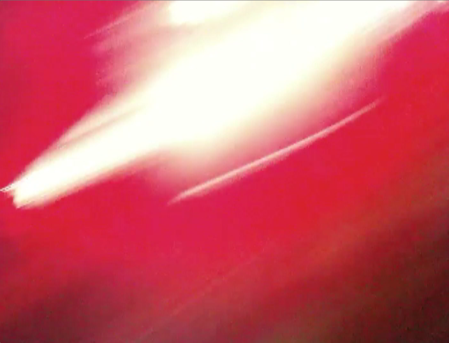
My main and ancillary texts use cross media campaign by using the same themes throughout. The advert and digipak will cover print media however whilst the advert will be used in magazines/newspapers, the digipak will be available to be viewed online and physically once purchased. The video being uploaded onto youtube and used on TV music channels. By using 3 different media texts we are able to promote the album/song to a much wider audience. The digipak features the album cover image but in full length, it also features the same font and font colour in both. The album cover itself is a still from the music video, a stagelight flooding into the camera lens. This still was captured during the performance of the band which audiences could relate the video to the ancillary texts. Another still from the video is used inside the digipak, of each member of the band. This links the music video directly to the digipak where audiences will recognise and be able to identify the band. The video contains the same font for "Moon Street" and "Depression Town" at the beginning which promotes the premise of the album digipack. We included a QR Code on the back of our digipak which would sit on the outside of the pack. This code can be scanned which then links to the music video on YouTube, a way of promoting one product through the other. This will also allow audiences to "Try before you buy" when in store.

In our research and planning we researched into the image of a famous artist and how it has been created. Through this research I discovered the image was mainly created through the use of album covers, music videos and posters. I looked at the artist Justin Bieber, a popular solo artist with a very defining image. I noticed how carefully constructed his image was through the use of advertising, album covers and music videos.
The outfits worn by the band are casual and are quite suited to the punk genre of the band. It also represents the target audiences gender and age well. The video itself creates a fun easy going and approachable image for the band, allowing for them to be accessible to a wide audience. The screenshots of the band used in the digipak not only references the music video but also acts as miscellaneous poster for avid fans.

I believe the combination of main and ancillary tasks have become very effective and integrate well to promote a product through different medias. This however could be improved by relating more to conventions of the genre in the digipak.


Evaluation 1

In what ways does your media product use, develop or challenge forms and conventions of real media products?

In researching for our media product I carried out research into conventions of music videos. It began with music videos in general, denoting the narrative, abstract and performance aspects. We soon realised that abstract suited more emotional pieces of music, whereas performance and narrative fit more heavier and energetic music. After choosing a song we then looked into music videos of a similar genre to obtain and review conventions that would create our video. The Blink-182 video for First Date featured the band performance of the song in the setting of a garage in an american home which was the inspiration for the setting to our music video. At the beginning of our video the name of the band and song appear, often used in contemporary music videos.  
One way that our media product follows/goes against the conventions of our chosen genre is through our album cover and sleeve. Most album covers of ska bands were mainly black and white, this colour scheme we thought although had iconography we decided didn't match the punk side of the genre or meet demands of contemporary audiences. We added a splash of colour to provide vibrance and energy, however the font and logo featured on our poster is black and white; for recognisability of the ska genre. By challenging this convention we were able to appeal to a wider audience and bring this genre into the modern day.
       The advert that we created followed typical conventions of contemporary adverts. We researched into album adverts of bands in with a similar genre that had debut releases, as well as other releases to gain a wider range of conventions so we had a more diverse approach to our advert. The poster features the album cover image and same text, a typical cross media campaign used by music media products. However on the poster we placed a logo for the band, not featured on the digipack. This was to attract an element of mystery as well as mimicking real artists by having a distinct logo for fans to instantly recognise with.
To challenge the forms of videos in the ska genre, we decided to use a wide range of varied camera angles and shots to match the pace of the song. In our research, we noticed that most the videos had mainly static camera shots which didn't match the songs pace at all; this being because popular ska music was around in the 1980's where technology made it difficult for rhythm editing.


Friday, 8 February 2013

final edit questionnaire and feedback


We constructed a questionnaire and a survey to gain feedback for our final edit of our music video. The questionnaire was handed out to a group of 30 students (the age of our target audience) after showing them the video.  We also created an online survey and posted the link with the youtube link on social networking sites to gain a range of feedback from a wider audience. 


Overall we are very happy with these results as they are all very positive and suggest very little room for improvement.  


Here is a screenshot from our online survey where people could leave comments.

final edit

This is the final edit for our music video which we have uploaded the video onto our Youtube account. We are overall very happy with it and will construct audience feedback to make sure it satisfies audiences.

Research into magazine advert

Record Labels design full page adverts for music magazines to promote an artists latest release. The magazine will often suit the target audience and fit with a similar genre of the artist. This method of advertising is very effective as genuine music fans will be interested. The advert is usually either a full page or double page spread, featuring: the album cover, the artists logo, release date and further information about the release. 
This is the poster for the band Peace which features the members of the band- the same image is used as their album cover. Other than the title of the release, the only other text is quotes from respectable music magazines approving of the release. The white and yellow font stands out from the reds and pinks used in the background, with the yellow font smaller and stating "the debut album out now" and the white larger font the artist and album title. A quote from The Fly being the only text revealing the genre of the band to give a hint to the audience what is being advertised. The quote at the top showcases a very much approving opinion from a well respected music magazine, dictating a 9/10 score which audiences no doubt be influenced by. The website at the bottom is put there for easy access to listen to their music. A small logo of the record label sits in the bottom corner of the poster.

This album advertisement is cleverly put together, an image of the band posing outside a typical english bricked house. The posters black & white colours are very reminiscent of The Smiths and indie/rock bands alike. The title of the band tilted with additional information using the same font and use of capitals. Two other quotes lie at the bottom, in lower case as this is secondary information for the audience. 

The advert for the artists fourth release shows nothing more than the logo, album title and release information. Because of the band have made a name for themselves this poster doesn't give away much as to what genre the music is because it assumes the reader already know who the Arctic Monkeys are. A very simple background allows the text to stand out over the soft hue of warm to cold colours. Further details are listed at the bottom with links to the bands website and record labels, with the logo once again featuring very small.

editing

We carried on using Final Cut Pro to edit the rest of our video. We matched the chorus' up with the filmed lip syncing aspects to our video. We used logic pro to record and edit the sounds for the lightbulb cutting out and the end guitar feedback. We imported the files onto our final cut pro document and edited them in timing with the song. At the start of the video, we looped the song on logic and muffled the pitch so that it seems as if the song is being played from the garage.

We toned down the saturation on the band shots to match the rest of the video as when they were juxtaposed with each other the colours contrasted too much. We decided to feature a lot of quick cuts from scene to scene to match the pace of the beat and slowed down the pace when the song suggested such as the breakdown near the end.

On a motion file we used the font that was previously used in the digipak and poster for the opening credits of the video. The text fades in and out seamlessly against the dark clouds in the sky, we did this to create a depressed feeling/tone to the song as mentioned in the lyrics. This is also a typical convention used in music videos.

Film Log (Day Two)


We had originally planned to film much earlier but had issues with getting all band members together to film on one day, but eventually we managed to organise it. For this filming session we did not need the band members instruments as we were just planning on filming themselves as a group of friends. We met the band in town and discussed our ideas and went to our first location, PJ McGinty's pub. Here we set up our camera and tripod in their outside area consisting of wooden tables. Here we would film the band casually having a drink and laughing to themselves, using medium shots. To introduce each member of the band we pulled up each member from the table one at a time and got them to sing a line from the chorus each. We used a mid close up so you could not only see the band member but also the rest of the band in the background. We used a light attached to the camera so that you could clearly see their faces, and contrasted to the dim lit pub in the background.

We then headed to the streets and filmed the band from different angles walking, using a pan to track their movement down the street. We gave the camera and tripod for the lead singer to hold whilst he walked along and sung. Because it was dark, we attached a light to the camera to light up his face. This gave the video a personal feeling making the lyrics more powerful in the song. We directed him with the band closely behind around ipswich as he sang into the camera.

We then went down to an off license to film a short part that would match the lyrics of the song. Our storyboarded idea was to have the band being bombarded by a robber who had come out of the off license however upon asking the owner he said we were unable to film. Therefore we decided to go round the side of the off license where you could see a large sign reading "Off License" and managed to pull off our idea.

Lastly we wanted to film in a supermarket however when asked several stores they denied us to film in there stores, so gave up on this idea as we realised it wasn't a necessary part of the video.

Hand Held Tripod technique


Digipak

This is the digipak for our media product, it includes the front cover, middle and back cover as well as a cd panel.


DIGIPAK: band poster


This is a mini poster we have decided to put inside the digipak of our CD. It will be in the centre fold of the booklet and will fold out to show all the members of the band. The image is a screenshot from the footage we shot in our first lot of shooting, it showcases the whole band and is quite comical. The lighting brings out the features of their expressions well and the saturated colours against the dark background are very eye popping. We included the names of each member using the same font to appeal to teen audiences, similar to posters in punk magazines such as Kerrang! In keeping with the front/back cover the names are tilted as if stuck on. The idea behind this concept was so younger audiences could stick this on their bedroom wall, like done so in magazines and other album booklets.

Wednesday, 19 December 2012

Album Cover Feedback


We printed 30 questionnaires that we devised ourselves after just finishing our design for the album front and back cover. This is are feedback for each question..


1. What are your first impressions of the album cover?
-Bright, colourful and attracts the eye.
-"It reminds me of strobe lights, seems like a party is going on"
-Very bright, simple but very effective
-Looks very unique original ideas 
-Well designed, artistic and looks profressional
-Intriguing 


2. Do you think the front cover looks like an authentic album cover?
28/30 said "YES"
2/30 said "NO"

3. Do you think the back cover looks authentic?
All answered with "YES"


4. What genre of music do you think this album sleeve would be suited to?
- Indie 10
-Punk 5
-Ska 4
-Dance 3
-Alternative 2
-Reggae 2
-Rock 2
-"Heavy and Loud"
-"Somthing fast paced"

Most people said it would suit an Indie genre, but mostly uptempo genres were suggested. 

5. Do you think the font matches or contrasts with the imagery?
- "Contrasts as it stands out"
-"The colours work well"
-"The simplicity of the font doesn't overpower the imagery"
-"Suits the imagery as it is simple"
"it matches and doesn't detract the impact of the imagery"
"Natural with image"
"The font makes the cover look profressional"
"The white font helps it stand out against the red"

"Too predictable"- Hipster

6. What do you like most about the covers?
-"The simplicity, yet maintaining boldness and creativity"
"Blues and reds work well"
"It draws my attention"
"It is very bright and intriguing"
"Vibrancy"
"Lots of energy"
-"Blurred colours, party-like"
-"Abstract"
-"The text"


8.

Sunday, 16 December 2012

Target Audience

Roles Of Team

We have specifically assigned ourselves to do different roles to get our video made as effectively as possible. Although often we collaborated and helped each other to carry out certain aspects to ensure that everyone's creative ideas were shared and produce something we were all satisfied with.
Editing- Jake
Filming- Izaak
Editing Music and Timing- Adam
Digipak- Ben
Poster-

Thursday, 13 December 2012

Creating the digipak: Ideas

After filming a set by the band Moon Street, we managed to pull some very vibrant and energetic screenshots created by the stage lights at their performance. The stills were very vivid and minimilistic but had this energy to them which we thought would suit the fast paced ska music they produce. The pinks and blues hue well together and the blurred streaks that occur provide the liveliness.

Here are the screenshots


Using these screenshots we have formulated four possible ideas for the album artwork in conjunction with this typewriter-esque font. The band's name is made larger and the album title smaller which is a typical convention in album covers.


Vassup


Wednesday, 5 December 2012

Digipak & Album Cover research

This album cover is from glam-rock band The Killers. The front and back match seamlessly both featuring a blueish hue. The band title and album title sit in the middle, both with different font to identify which is which. You would assume the band is called The Killers because the font is larger and sits on top rather than below.
The back cover features the song titles in the top right, listed and numbered. At the bottom information about the record label can be found with the record label logo. Also a barcode features for sale in stores.


This is the front/ back cover for the Arctic Monkeys album Favourite Worst Nightmare. It is not a typical hard plastic casing digipak, instead a soft card with a plastic ring inside to hold the CD.


Here the songs feature at the bottom with merely but a space between each song title. This is so the buyer can identify what tracks will be on the album and the order. 


The digipak opens outwards left and right to reveal the CD, this method of packaging is becoming more and more frequent as artists get to display more visuals.


Rough Cut Feedback

The Rough Cut was shown to our media class in full and we then asked for their thoughts on all aspects of the cut. Here is the feedback:

The Good:
-The fish eye lens gave the video a creative edge and suited the genre of music exceptionally.
-The lip syncing and timing was spot on and never out of time.
- The lighting enhances the performance shots, the saturation of colour works well and enables the band members to stand out from the background.
-The varied use of camerawork stood out for some as they thought it gave the video more energy and gave the video a more interesting aspect visually.
-The fast paced editing matches the song in the correct areas, in particular the bridge and chorus.
-The opening drew the audience in and created a slow build up to the actual song.
-The narrative aspect of the light bulb received positive reactions also as many said it added a sense of humour into the video and kept the audience entertained.

The Not So Good (Areas for improvement)
-The footage of the live set had some interesting colours and provided an energetic aspect but was not in keeping with the lighting and quality of the rest of the video. This we will consider taking out or using elsewhere in our coursework.
-The Girl dancing to the song didn't feature much and many were curious and didnt understand why she was there. This we will hopefully expand on when we go out on our second shoot.
-There were possibly too many of the same shots used of the performances. This again we will balance out when we film our further ideas.

In general the comments received were extremely constructive and gave us confidence which we will carry on through to when we film the rest of the video. We will make adjustments to improve our video where the negative feedback instructed us to do so. This feedback has helped us to stay on track

Rough Cut


Here is the rough cut footage of our music video we uploaded to YouTube. We've assembled all the footage from our first shoot into order to give us an idea of what the video looks like and what else needs to be done. We are very happy with the outcome so far, all our ideas have come together very fittingly and its all in keeping with the tempo. 
The opening sequence we have looped the guitar strumming and muffled it so that it appears the band are actually playing the garage as the camera pans and follows through. The chorus' work extremely well I feel where we have edited the four shots from each corner directly on the beat. The break in the song is where our idea that the bulb goes out and the lead singer taps it to get it working again, and thus the song continues. We will use a sound effect there to accentuate that and make it more realistic. 
The use of fish eye lens manages to fit the whole band in, also making the room feel even smaller and at times claustrophobic. This matches the lyrics and tones of the song appropriately.
The point of view shot from the drumstick gives the video an interesting visual as well as the views from the neck of the guitar looking down on the strums. The part of the video where the musicians are dancing we used different techniques such as pans and varied camera angles which make for an exciting illustration of that part of the song.
At the end of the video our idea is to use a reverb of guitar noises you would hear at the end of a live song, to enhance the realism of the performance. The shot from inside the fridge shows the band members relax with a beer, as if just finished playing the song. We shot it so that each beer would eventually go and the fridge door closes behind with a fade to black marking the end of the video.